GTFS renderings
May 5, 2021After recently revisiting an old project from 2012 and re-rendering animations of public transports in London in higher resolution, I gave it a try with GTFS data from other cities that I have lived in.
This was made possible by the wide availability of GTFS data for many large cities around the world, something that wasn’t really a concern of public transportation agencies when I first explored this idea nine years ago. At the time some agencies were even strongly opposed to what is now known as the “Open Data” movement, and resisted opening their data sets to the public.
GTFS 
GTFS is the General Transit Feed Specification format, a set of rules for CSV-based text files that describe the planned schedules of public transit vehicles. Originally developed at Google in 2005, it has become a de facto standard for static schedules.
A separate format, GTFS Realtime, is an extension of GTFS that can be used to share real-time public transit data in the form of updates made to the original schedule. Agencies can use it to communicate delays, cancellations, changed routes, etc.
A GTFS feed is usually distributed as a compressed archive containing a few text files. The data model is relatively simple and yet also extensible, although the number of required fields is somewhat limited. Some feeds might provide more detailed data with route metadata such as the background and label color associated with a bus line, but only the most essential data is guaranteed to be included if the feed follows the specification.
GTFS data types 
GTFS defines a few object types that relate to each other:
A Route is a group of trips displayed to riders as a single service. This is what we generally refer to as a bus line, or metro line for example. It is identified by a route_id and has attributes like a route_short_name, a route_long_name, a route_type (metro/bus/rail/tram/boat…), a route_color (optional), and a few more.
A Stop is where vehicles pick up or drop off riders. It is identified by a stop_id, can have a stop_name, and must have a stop_lat and stop_lon describing its coordinates. This is the physical location of a station or bus stop, not the arrival of a vehicle at a certain time. Some agencies will include other metadata like wheelchair_boarding for accessibility or level_id for multi-story stations.
A Trip is the scheduled journey of a vehicle following a Route and going from Stop to Stop, identified by a trip_id and linked to a single route_id. It can have attributes like direction_id (inbound vs. outbound) or bikes_allowed. Trips do not detail their schedule, this is done with StopTime records.
A StopTime describes when a vehicle traveling for a Trip along a Route will be at a Stop. It has a trip_id, a stop_id, an arrival_time and departure_time in HH:MM:SS format, and a stop_sequence providing an order for these points along the Trip. The full sequence of StopTime records for a given Trip, joined to their corresponding Stops and ordered by stop_sequence, is what you might see inside a bus on a board listing all the planned stop times and locations for this vehicle.
These records are all in individual CSV files bearing the same name as their record type (e.g. all Route entries in routes.txt), and a few other files can enrich the data set although they are all optional. For example, fare_{attribute,rules}.txt list the costs associated with routes, calendar.txt and calendar_dates.txt help to separate weekday vs. weekend service, transfers.txt describe how long travelers have to switch vehicles at a stop, etc.
A post on the Interline blog goes into more depth and explores some of the metadata in GTFS files for the San Francisco Bay Area.
I found GTFS very easy to understand, and have no doubt that its simplicity is what made it so popular.
GTFS and SQL 
In addition to being trivial to parse, these files can also be imported into SQLite with just a few commands. I often used SQL to debug missing vehicles or find the details of a Route when I was working on these renderings.
Here’s how we would look up 5 metro lines from the Paris STIF data set:
sqlite> SELECT route_id, route_short_name, route_color
        FROM routes WHERE route_type = '1'
        ORDER BY route_id ASC LIMIT 5;
route_id     route_short_name  route_color
-----------  ----------------  -----------
100110001:1  1                 FFCD00
100110002:2  2                 003CA6
100110003:3  3                 837902
100110004:4  4                 CF009E
100110005:5  5                 FF7E2E
Given a route_id we can list its schedule Trips, here two random trips on line 1:
sqlite> SELECT trip_id, trip_headsign FROM trips
        WHERE route_id = '100110001:1'
        ORDER BY RANDOM() LIMIT 2;
trip_id             trip_headsign
------------------  -------------------------
125111807-1_212922  La Défense (Grande Arche)
125025182-1_213183  Château de Vincennes
(trip_headsign is what you’d see on the schedule board as the vehicle’s destination)
Then for these two trips, let’s look up the first 5 planned stops, their time, and location:
sqlite> SELECT substr(trips.trip_id, -6, 6) AS `trip`,
        stop_times.departure_time AS `departs`,
        stop_times.arrival_time AS `arrives`, stops.stop_name, stops.stop_lat,
        stops.stop_lon, stop_times.stop_sequence AS `seq` FROM trips LEFT JOIN
        stop_times ON (trips.trip_id = stop_times.trip_id) LEFT JOIN stops ON
        (stop_times.stop_id = stops.stop_id) WHERE trips.route_id = '100110001:1'
        AND trips.trip_id IN ('125111807-1_212922', '125025182-1_213183') AND
        CAST(stop_times.stop_sequence AS INTEGER) < 5
        ORDER BY trips.trip_id ASC, CAST(stop_times.stop_sequence AS INTEGER) ASC;

trip     departs    arrives    stop_name                  stop_lat   stop_lon   seq
-------  ---------  ---------  -------------------------  ---------  ---------  ---
213183   08:14:00   08:14:00   La Défense (Grande Arche)  48.89182   2.23799    0
213183   08:15:00   08:15:00   Esplanade de la Défense    48.88835   2.24993    1
213183   08:17:00   08:17:00   Pont de Neuilly            48.88550   2.25852    2
213183   08:18:00   08:18:00   Les Sablons (Jardin d'acc  48.88129   2.27191    3
213183   08:20:00   08:20:00   Porte Maillot              48.87800   2.28246    4
212922   19:26:00   19:26:00   Château de Vincennes       48.84432   2.44055    0
212922   19:28:00   19:28:00   Bérault                    48.84536   2.42824    1
212922   19:29:00   19:29:00   Saint-Mandé                48.84623   2.419      2
212922   19:30:00   19:30:00   Porte de Vincennes         48.84701   2.41081    3
212922   19:32:00   19:32:00   Nation                     48.84811   2.39800    4
After adding a few indexes on the <type>_id fields, even complex queries over a large data set are pretty snappy.
For reference, the GTFS data set for Paris lists 1,882 routes (lines) over which 443,026 vehicles will journey between 63,676 stops for a total of 9,921,422 scheduled stop times.
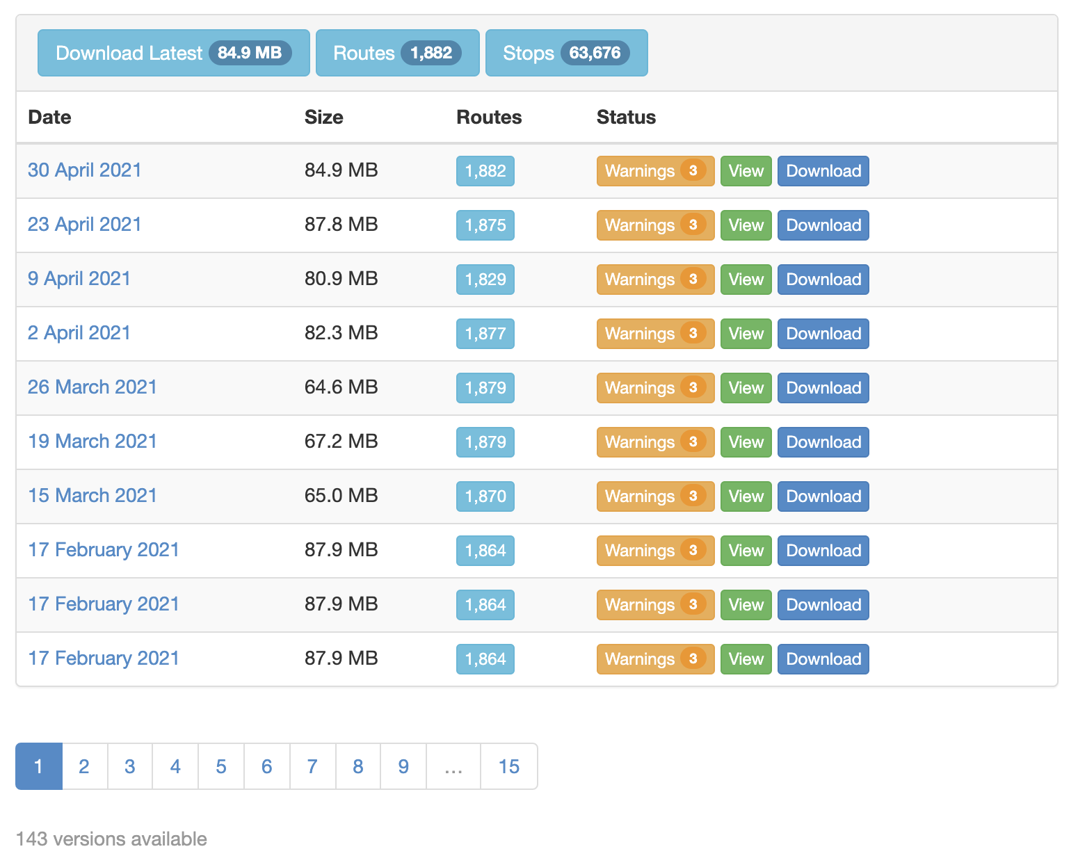
OpenMobilityData 
OpenMobilityData is a free repository of GTFS data providing access to over 1,200 feeds from public transit agencies in more than 50 countries. It is maintained by a Canadian non-profit organization and hosts high-quality data sets that are frequently updated.
Feeds that aren’t fully valid according to the GTFS specification are clearly labeled, with mistakes listed on the download page:
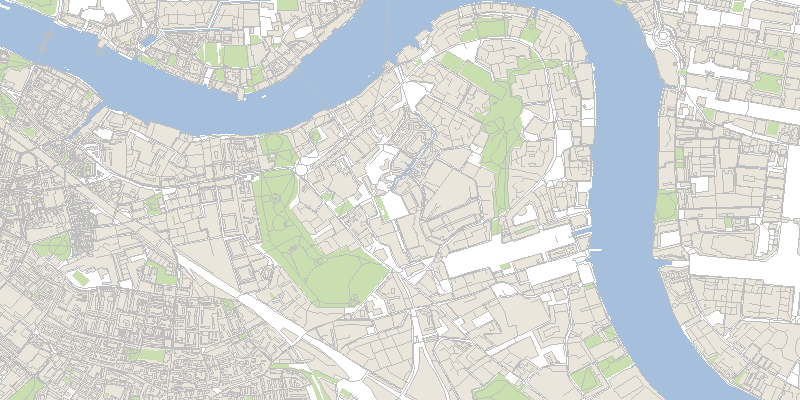
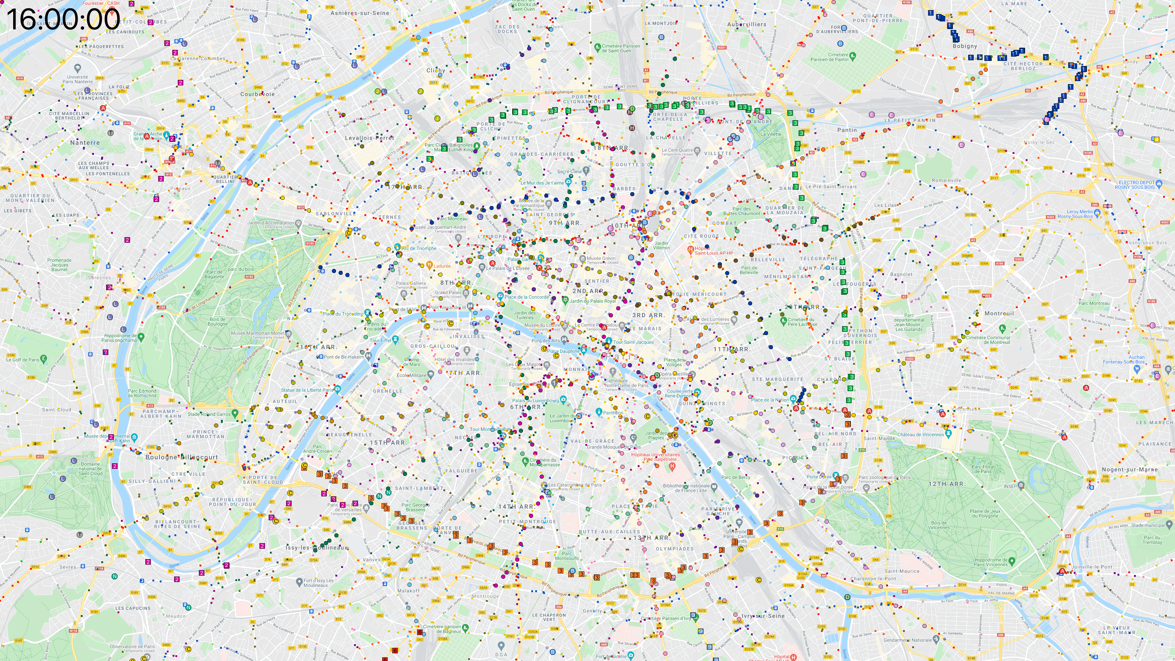
Paris, center 
Paris and its closest “proche banlieue” suburbs:
I also generated a longer version where the vehicles can be followed more easily.
At 4 seconds per frame and a 6-minute run time, they tend to zip across the map very quickly; at 2 seconds per frame,  the slower video is 12 minutes long.
Click here to see a 4K frame from this video.
Paris, wider area 
Paris and the wider “Île de France” suburban area:
This rendering also has a
slower version, again 12 minutes long.
Click here to see a 4K frame from this video.
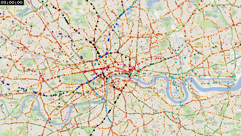
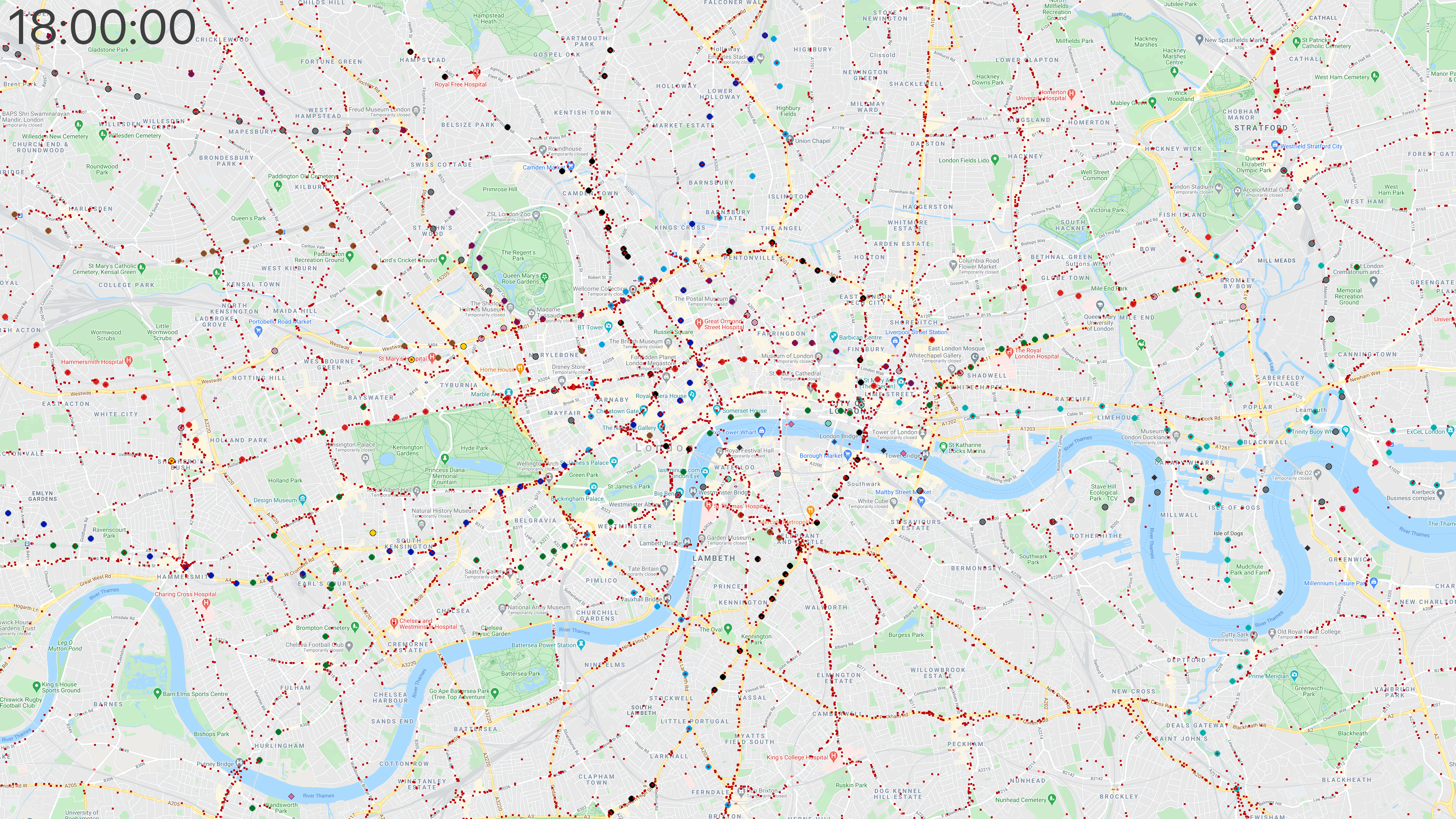
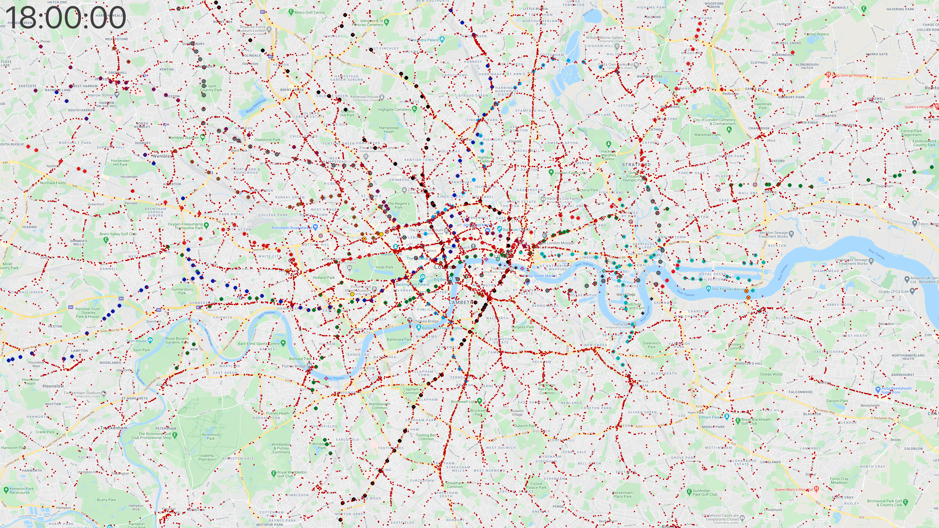
London, center 
This section is copied from a previous article, to collect all renderings on a single page.
Since OpenMobilityData didn’t have feeds for Transport for London (TfL) vehicles, I combined the London Tube schedule in GTFS format from the data analysis platform hash.ai, and the London bus timetables on the British government’s Bus Open Data Service website.
Here’s the rendering with data from April 2021, zoomed in to show the center of London:
Click here to see a 4K frame from this video.
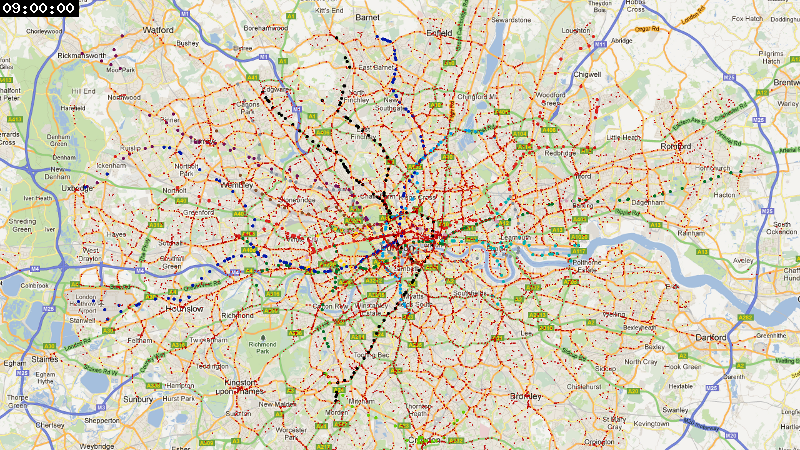
London, wider area 
I also rendered a larger area, since the public transport network extends pretty far away from the city center:
Click here to see a 4K frame from this video.
San Francisco and Oakland 
For this area, I started by cropping a map of the Bay Area to focus on San Francisco and Oakland. Here, we see mostly SFMTA buses and Muni metro light rail in San Francisco, with also a few BART trains crossing the Bay, Caltrain commuters coming from the south, and AC Transit buses in Oakland.
Finding data for the Bay Area is more challenging than for Paris and London, due to the number of operators involved. Thankfully the Metropolitan Transportation Commission publishes a common API to download GTFS schedules for 33 local operators on the website 511.org. The rendering below is based on data from all of these feeds, even though not all companies operate in the cropped area.
The difference between this region and Paris or London is striking, and reflects the vast difference in public transport funding and use between these cities. Whereas Paris and its close suburbs has over 1,200 trains and 5,600 buses running at rush hour, we only see a maximum of 30 trains and 800 buses here.
Click here to see a 4K frame from this video.
San Francisco Bay Area 
Similar to SF & Oakland, this time extended to show the entire San Francisco Bay with San Jose in the south and up to parts of Marin County in the north and Livermore in the east. We can spot the automated trains at San Francisco Airport, as well as the Blue, Green, and Orange lines of VTA light rail in the South Bay. There are even a few buses roaming around Half Moon Bay by the ocean.
At rush hour the map shows as many as 60 trains, 1,600 buses, 70 trams, and 10 boats.
Click here to see a 4K frame from this video.
To be continued? 
I’d like to add more cities in the future if I can find high-quality data; I was thinking to try New York City, Beijing, or Tokyo next. Depending on the amount of metadata included in the GTFS feeds, the process can take some time if I have to add color or route type information manually for a few routes.
Comments and suggestions are welcome! You can contact me on Twitter.